

For this Project I was asked to develop a modular typeface in response to the work of Rosemarie Tissi. My decisions on the visual quality of the typeface was informed by my understanding of the theory and practice of Tissi's work within typography and swiss graphic design.


Rosemarie Tissi is a Swiss Graphic Designer so for my project I have researched both her own work as well as Swiss Graphic Design and the International Typographic Style also known as “Swiss Style”. To broaden my project contextually I have looked at and researched the work of Graphic notable and relevant Designers from the “Swiss Style” movement including Josef Muller Brockmann, Max Huber, Armin Hoffmann and Max Miedinger as well as the culture in the 1940s,50s,60s,70s and 80s as these areas would have all had an impact on Rosemarie Tissi’s work.I have also focused elements of my research on the Helvetica typeface which was developed by Max Miedinger in 1957, this linked with the work of Rosemarie Tissi as well as being an influence for the Swiss Style movement.
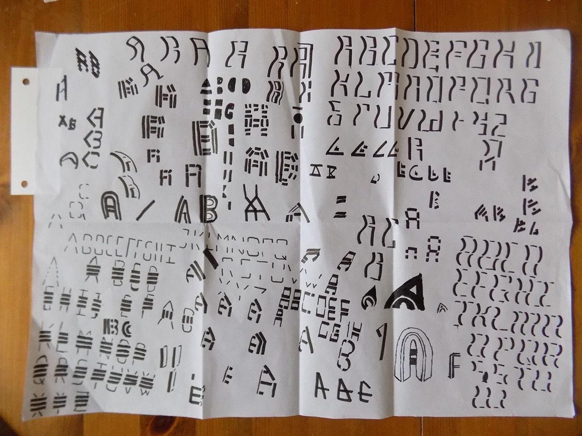


Based on my Research I have explored different routes through tests and experiments with various typographical ideas before finalising my design. As part of my creative process I have used Calligraphy pens and brushes to experiment with strokes and form of the letters.
For my own design I have also looked at “The persistence of Memory” by Salvador Dali. This is the painting with the melting watches, which create curving flowing lines and shapes. I have looked at this piece as I wanted to look at work which contrasted against the typefaces of Rosemarie Tissi, so I had more reference points and scope for experimentation.
I have chosen to look at the use of lines in a modular format to create both the main body and elements of my typeface and negative space.
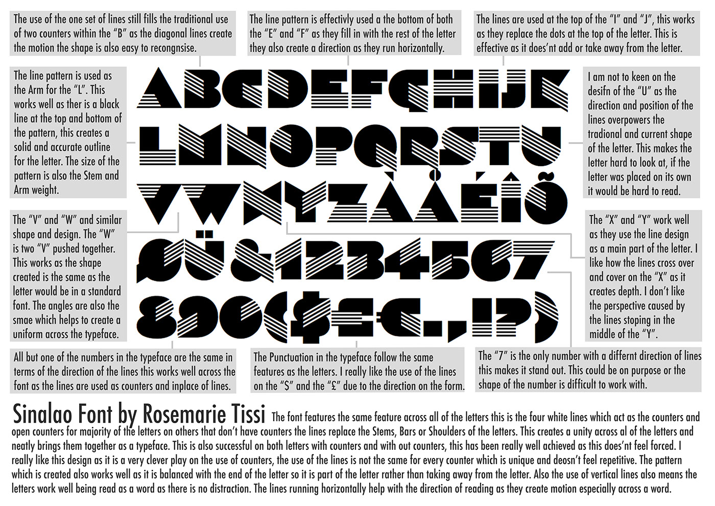
Within this I have also looked at using lines which break up letters and subsequently create modules within my design. With the main stem of the letters being a consistent element across the typeface. I have also looked at and experimented with the use curving lines and the idea of perspective all features from “The Persistence of Memory” and areas of Tissi’s poster designs. This was done through experimentation with marker pens as well as ink and a Brush. To further my project, I have also experimented with the use of lines to create patterns within my typeface, similar to those in Sinaloa typeface. I have done this as almost a variation of my typeface as the same key elements are used in both.


Primary Typeface.

An extension I have made to this project is by adding Tissi's stripe design to the base of the right stem of the letters.


Secondary Typeface.

Variants of the typeface.


Example of use.


